Prior to creating my film poster on Photoshop, I decided to explain a previous production I had created as part of my coursework last year.
I have used Photoshop since last year when I started my AS Level in Media Studies. My assignments were to create a front cover, a contents page and a two page spread of a created magazine, which all totalled for my coursework mark. I had never used Photoshop prior to this and did not have any instructions on how to use it as I had joined the course a month later than the rest of my class. My first task set by my lecturer was to play around with the font and the backgrounds, to get used to the tools palette. Looking back now, this was of more help for me because it allowed me to be independent as apposed to being told what I should do and having the same outcome as everyone in my class. I gradually became more experienced in using Photoshop and began to create my first assignment, which was to create a magazine front cover.
The front cover required most of the things that the film poster will require, with roughly the same layout and content. To achieve top marks, I needed to make my magazine design appear as realistic and look official. I was required to fit certain objectives, such as: to include a barcode, to include my own photos and to include a magazine name. Before I created it, I briefly planned out ideas for the magazine’s layout, text and the title. When they were all consolidated, I chose the best designs and decided on a final one.
I first started with choosing my magazine name, sorted out the content of the text on the front, then chose a picture to support the main magazine headline, and finally sorted out the little details. All of the front cover was created on Photoshop and I used the majority of the standard tools on the tools palette.
The tools palette:
 [1]
[1]This is the final design of my magazine front cover:
The next assignment was to create a contents page. This was not as complicated as the front cover as it followed a typical layout in comparison with other magazines. The only key objectives that I needed to complete were to make sure that the numbers and pages made sense (that my double page spread was on the correct page numbers) and also to make sure it is easily readable.
I first sketched out plans of what the contents page would look like. I came up with 3 sketches and I chose the one that I thought suited the magazine best. When the correct template was created, I began to think of other storys to involve in the magazine, just for the purpose of the contents page. I then wrote a list of storys with their corresponding numbers on a sheet of paper so I could type them up later.
The first part of production on Photoshop was to create a grid with the pen tools, so that the layout was neat and readable. I also left room for small pictures to be inserted on the contents page. After this, I typed up all the required font for the page, then finally including the pictures.
All of the contents page was created on Photoshop and included pictures and text.
This is the contents page:
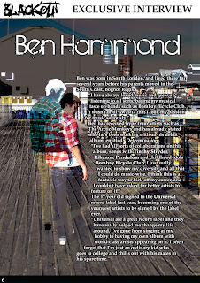
This is the double page spread:


No comments:
Post a Comment